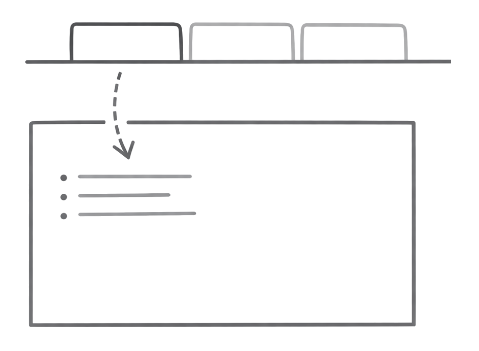
Tile
Visual preview cards with patterned backgrounds for showcasing content
Tiles display content previews with a styled pattern background, perfect for showcasing integrations, templates, or visual elements.
Basic Tile
A simple tile with a preview image and title:
<Tile href="/components/tabs" title="Tabs Component">
  <img src="/images/tabs-preview.png" alt="Tabs" />
</Tile>
Tile with Description
Add a description for more context:
<Tile
  href="/components/tabs"
  title="Tabs Component"
  description="Organize content into switchable tabbed sections"
>
  <img src="/images/tabs-preview.png" alt="Tabs" />
</Tile>
Grid Layout
Tiles work with CardGroup for responsive grid layouts:
<CardGroup cols={3}>
  <Tile href="/components/tabs" title="Tabs">
    <img src="/images/tabs-preview.png" alt="Tabs" />
  </Tile>
  <Tile href="/components/tabs" title="Tabs">
    <img src="/images/tabs-preview.png" alt="Tabs" />
  </Tile>
  <Tile href="/components/tabs" title="Tabs">
    <img src="/images/tabs-preview.png" alt="Tabs" />
  </Tile>
</CardGroup>
Dark Mode Images
Use Tailwind classes to show different images in light and dark modes:
<Tile href="/customization/theming" title="Theming">
  <img src="/images/theme-light.svg" alt="Theme" className="dark:hidden" data-no-style="true" />
  <img src="/images/theme-dark.svg" alt="Theme" className="hidden dark:block" data-no-style="true" />
</Tile>
The noStyle attribute prevents default image styling so the dark mode classes work correctly.
Properties
The URL the tile links to. Supports both internal paths (/docs/intro) and external URLs (https://example.com). External links open in a new tab.
Title text displayed below the preview area.
Optional description text below the title.
Content to display in the preview area. Typically images or SVGs.