Columns
Responsive grid layout for displaying Cards, Tiles, and other content side by side. Automatically adapts to screen size.
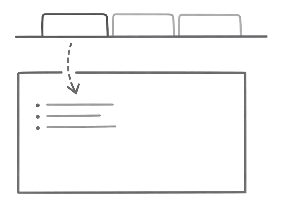
Columns creates a responsive grid layout for displaying content elements side by side. The grid automatically adapts to smaller screens, stacking on mobile and expanding on desktop.
Use Columns to display content side by side in a responsive grid. Works with Cards, Tiles, images, and custom components.
Basic Usage
Display content in two columns (default):
<Columns>
  <Tile href="/components/tabs" title="Tabs" description="Organize content with tabs">
    <img src="/_jd/images/tabs-preview.webp?v=mof559f5" alt="Tabs preview" />
  </Tile>
  <Tile href="/components/tabs" title="Tabs" description="Switch between views">
    <img src="/_jd/images/tabs-preview.webp?v=mof559f5" alt="Tabs preview" />
  </Tile>
</Columns>
More Columns
Use cols={3} or cols={4} for denser layouts:
<Columns cols={3}>

  ...

</Columns>
Choosing Column Count
| Content Type | Recommended Columns |
|---|---|
| Tiles with images | 2-3 |
| Text-heavy items | 2 |
| Small metrics/stats | 3-4 |
| Image comparisons | 2 |
Responsive Behavior
Columns automatically adapt to screen size:
- Mobile (< 768px): 1 column
- Tablet (768px - 1024px): 2 columns max
- Desktop (> 1024px): Full column count
Props
Number of columns per row. Accepts values from 1 to 4.